Stamps.com
I created a visual representation of the registration procedure and developed a comprehensive step-by-step guide to help clients better understand the process. This initiative resulted in a lift of 8.26% in conversion rates.
My Role: UX Researcher, UI Designer, Responsive Layout
Scope: UX|UI Design, A/B Testing, Prototyping


Background
Stamps.com is an online postage service that allows users to print postage stamps and shipping labels directly from their computers, providing convenient mailing solutions for businesses and individuals.
This case study delves into my role as a UX/UI designer at a conversion rate optimization media company, highlighting how a systematic approach to A/B testing and data-driven decision-making empowered me to strategically revamp a perplexing sign-up page.
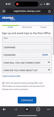
Control:
-
Page lacks explanation for the necessity of creating an account
-
Customers are abandoning carts
-
Client wants decrease bounce rate

Problem
Users are abandoning the registration process due to uncertainty, finding it difficult to obtain the necessary information they require.
Solution
Our proposed solution involves adding a "How It Works" section to the page, making crucial information easily accessible within the registration flow. By addressing users' questions and concerns, this enhancement aims to decrease bounce rates and guide more users through the conversion funnel.
Impact
The redesigned stamps.com registrations page led to an 8.26% increase in conversion rates, equivalent to an estimated quarterly gain of 372 registrations. Implemented after a 19-day testing period, the strategic placement of the "How It Works" section and user-friendly icons enhance visibility and ease of use, motivating users to complete registrations.
The Process

.jpg)
Proto Persona
Empathy Map
.jpg)
Collaboration
Effective collaboration across functions is crucial for initiatives like this. I closely collaborated with developers, product managers, and stakeholders to guarantee a smooth and productive product development process.
Hypothesis
We believe that the integration of visual representations in the "How It Works" section, positioned below the registration form and accompanied by clear, concise iconography, will result in improved conversion rates and facilitate an intuitive registration process.
How Might We?
How might we provide customers with confidence in the simplicity of the registration process?
Iconography
I collaborated closely with the stakeholder to carefully choose custom icons, ensuring they align with the section's goals and visual identity, enhancing both design aesthetics and effective communication.
Prototyping & Iteration
Initially, I organized the "How it Works" section in a mobile-friendly list format. However, the client preferred a carousel version, and we opted to test and implement that design.

Original Mockup

Iterated Mockup


Final Prototype & Testing
In our A/B testing, we decided to explore the positioning of the "How It Works" section, with Variation 1 featuring the section below the form and Variation 2 placing it above the form on the page.


Results
Variation 1 came in as a strong winner ("How it works" below form") with a lift of 8.26% and was pushed live. The estimated quarter lift for this test was 342, based on registration lifts during the 19 day testing period Variation 2 came in as a null with -2.69% in conversion.
What we learned
Placing the "How It Works" emphasis below the form proved effective in this location! This strategic placement enhances visibility as customers commence their registration, with clear and concise tiles highlighting ease of use, compelling the audience to complete the registration process.